
Quizzes are in beta. Every setting on this page is off or empty by default, so a quiz you built before looks exactly as it did until you change something.
Screens and colours
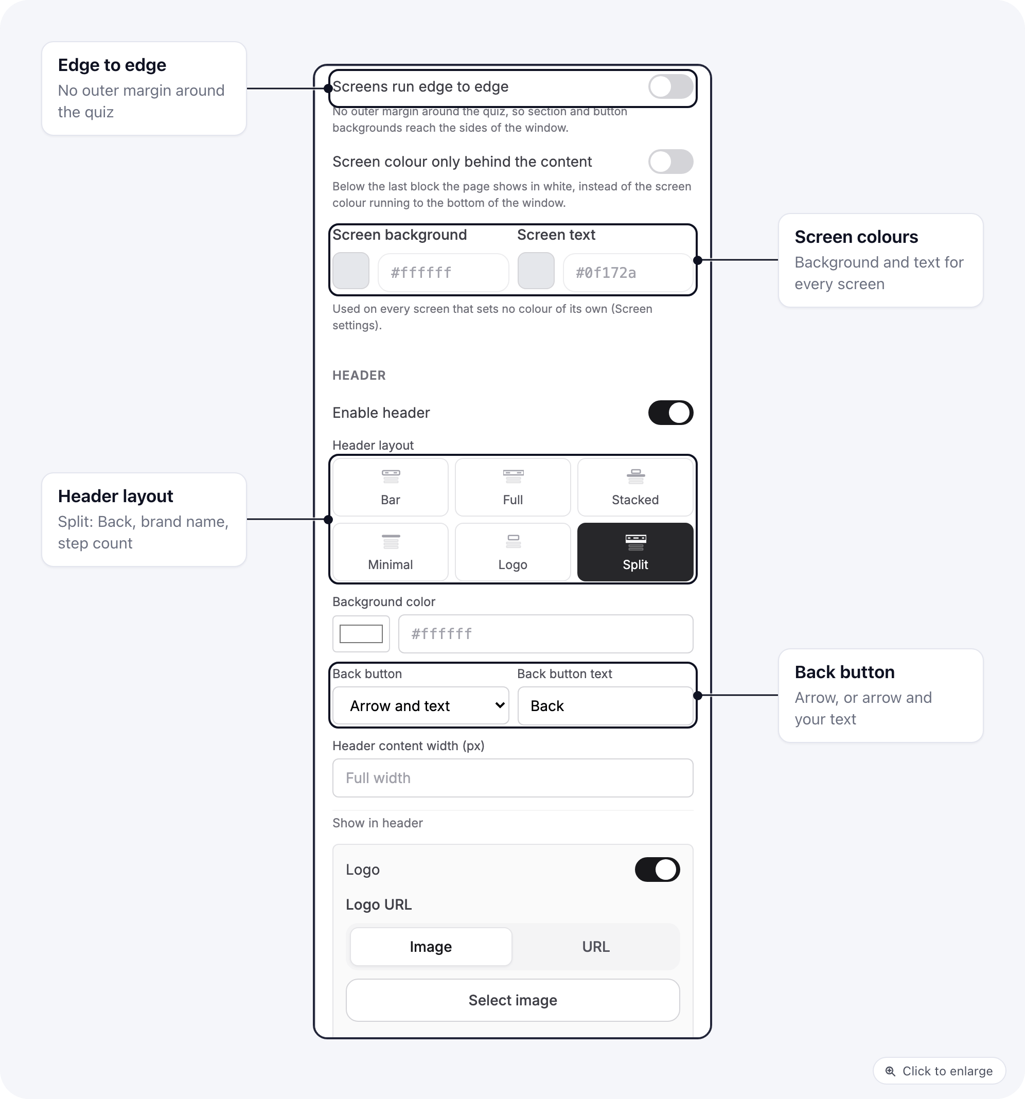
- Screens run edge to edge removes the outer margin around the quiz, so section and button backgrounds reach the sides of the window.
- Screen colour only behind the content stops the screen colour under the last block. Below it the page shows in white.
- Screen background and Screen text colour every screen that sets no colour of its own.
Header
The header is one component, used by the builder canvas and the live quiz alike. Turn on Enable header, then pick a Header layout: Bar, Full, Stacked, Minimal, Logo or Split. Split puts three things in a row across the full width: the Back button on the left, the brand name in the middle, and a step count on the right, with a thin progress line under it. The header settings that go with it:- Back button: Arrow, or Arrow and text with your own Back button text.
- Brand name (under Show in header), shown next to the logo or on its own. Brand name style is Bold or Spaced wordmark.
- Progress bar style Thin line, with its own Thickness (px), Track colour and Progress colour.
- Step counter (N of M) counts question screens only, so interstitials, loaders and result screens do not change the total.
- Header content width (px) lines the header’s contents up with a column of that width; empty means Full width.
Colours for one screen
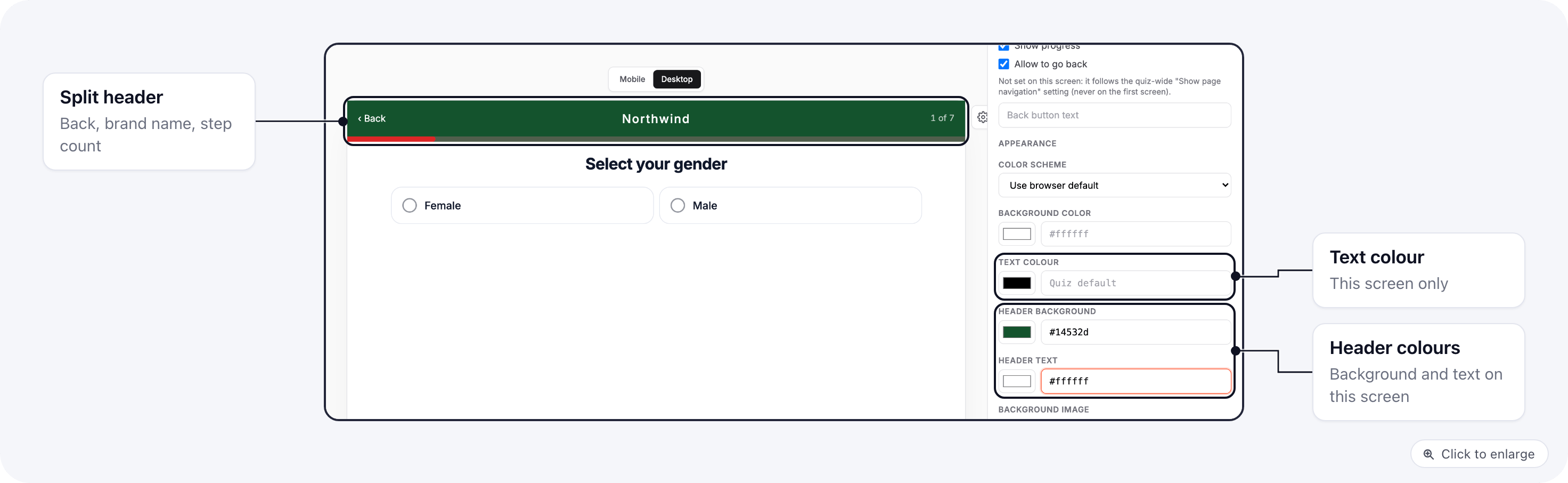
- Text colour for this screen’s text.
- Header background and Header text, for example a dark header on the screen that opens the quiz.
Sections
Select a section block on the canvas to style it as a band of its own:Answers and buttons
On a single choice, multiple choice, yes/no or rating block, the Template list has two new presets:- Boxed cards: a centred column of plain cards, the icon in a tinted circle and a ring as the selection mark.
- Solid buttons: filled buttons side by side, each in its own colour, for a “pick one to start” row.
Loaders, height and weight, rating summary
- Loading block, Template Checklist: an image, the title, a thin bar, then each step lighting up at its time. Set the Bar colour, Bar background, Layout (One under another or Side by side) and Fill the screen height.
- Height and Weight blocks, Field style Filled boxes: the number sits in filled boxes and the unit toggle becomes a segmented switch.
- Rating summary block, Template Faces and stars: a row of up to six faces beside the stars. Add one image URL per line under Faces (one image URL per line), and set the Card background and Max width.
Typography and corners
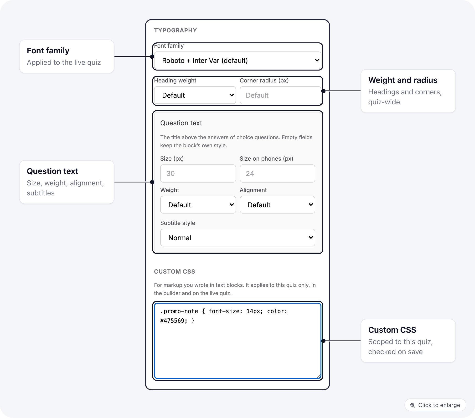
- Font family is applied to the live quiz.
- Heading weight and Corner radius (px) apply across the quiz.
- Question text styles the title above the answers of choice questions: Size (px), Size on phones (px), Weight and Alignment. Empty fields keep each block’s own style.
- Subtitle style Small capitals sets subtitles in small spaced capitals.
Custom CSS
For markup you wrote yourself in text blocks, add rules under Custom CSS at the bottom of the Design tab. The CSS applies to this quiz only, in the builder and on the live quiz, and is scoped to the quiz so it cannot restyle the rest of the page. It is checked when you save. The builder refuses CSS that contains<style> or <script> tags, @import, javascript: links, or braces that do not match, and shows “This CSS cannot be saved” until you fix it.
Related
- Build and publish a quiz: templates, saving drafts and the publish checks.
- Quiz blocks and answers: loader timing, answer icons, height and weight, variables, validation and the Back button.
- Design a quiz page intro: your own page before the quiz.